



Graphics for this article were edited by Katie Marriner.
Editor’s note: We did the number-crunching for this article before Politico published a new account of sexual assault allegations against Maine Democratic Senate candidate Graham Platner. It now looks like Platner will imminently end his campaign, though a decision has not been announced.
Because he has not yet dropped out, however, we have decided to go ahead with this article that includes polls of a Platner vs Susan Collins general election. The topline numbers you see here will stand if Democrats nominate a candidate who polls at least as well as Platner did against Collins prior to the allegations.
It’s a midterm election and the polling average to watch this early is the generic ballot average. That’s the question that asks voters who they would cast their ballot in their local U.S. House district if the election were held today.
Democrats lead our average on this question by roughly six points. That’s a slight decrease from their position a month ago, and just below where the party was at this point in 2018 — when the party won 235 seats in the House in what pundits called a “blue wave” election.
But the generic ballot is a national number. While it is predictive of the national popular vote for the House, actual seat-level outcomes can diverge sharply from what is implied by the national environment (incumbency, experience, and candidate effects can matter a lot — ask Richard Mourdock). Nobody casts a vote in a national election — control of Congress gets decided seat by seat, in 435 districts and 33-odd Senate races.
This means the generic ballot can only approximate what voters are saying in individual races. Which invites an obvious question: what do the actual seat-level surveys say?
Lucky for readers, 50+1 has all the polls of these individual races and can do the math! In this piece I preview our upcoming general election polling averages for the House and Senate and compare the implied national environment from these surveys against the generic ballot. I also take stock of the current race for the Senate using the portion of our upcoming election model that estimates opinion today in each competitive Senate race — something we’re calling a “nowcast” of the election. More details below.
Paid subscribers to 50+1 get access to premium analysis, plus sortable tables and complete data access on our polling website. If you want to follow the 2026 cycle with the best data at your fingertips, become a paid subscriber.
And if you’re in the market for either the raw polling data used in this analysis, pre-calculated polling averages, or the data behind our upcoming election forecast for each House and Senate seat, check out our API subscription and get in touch about enterprise-level data access.
Two ways to measure the political environment
To be clear, we like the generic ballot. It’s one of the best early indicators we have for the House, and it gets more predictive as Election Day nears. Our average of D+6 today should be taken seriously as a robust historical predictor of the eventual national environment according to polls on Election Day.
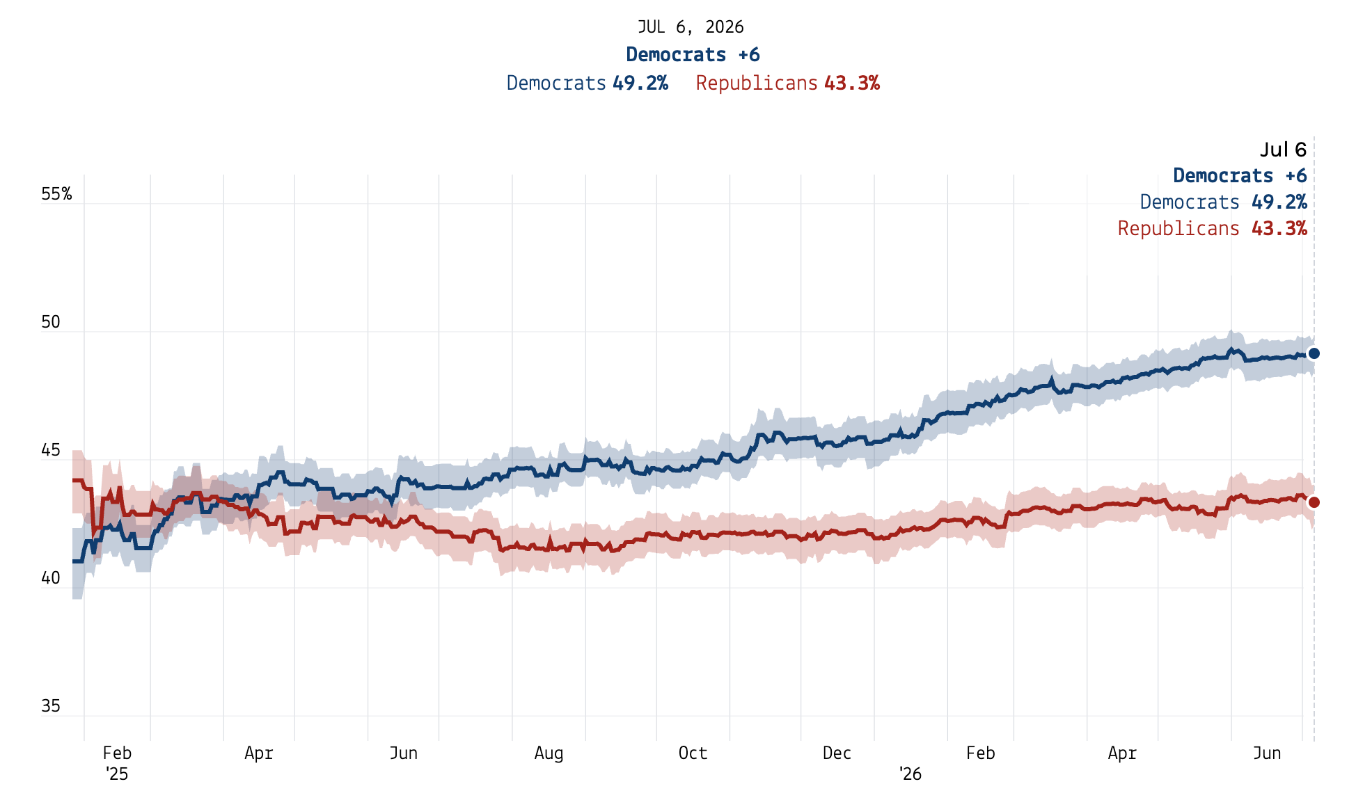
Historically the out party tends to gain a few points in the generic ballot from now to November, but other than that if you were predicting House elections and had to pick between nothing and the generic ballot, you would take the generic ballot every time.
But seat-level surveys are a much better predictor of seat-level results. They ask about actual votes in a given race — not which party voters they would prefer in the abstract, but which candidate they are actually going to choose in a real election.
Right now we’ve got polling averages running behind the scenes here at 50+1 in 25 of this cycle’s contested races — 9 House and 16 Senate contests. Let me briefly explain how our polling averages work. (If you’re a real wonk, the full methodology lives here.)
State polling averages
Our seat-level averages are built the same way for every race, House or Senate, in four steps.
Decide which polls count. First we filter all the polls for a given race to exclude those of hypothetical matchups: surveys testing, for example, Mike Rogers vs. Gretchen Whitmer in Michigan are discarded (the latter is not running for Senate). Then, we limit each poll to one sample — if a pollster tests the race among all adults, registered voters, and likely voters, we prefer the latter (and we prefer RV to adults). Then, to keep our average recent, we filter to the last 90 days of polling (but if polling in that window is too thin we reach further back until we have the five most recent polls in each race).
Some other minor restrictions apply and are noted here: for example, we do not include “polls” that use MRP or other statistical models to turn national samples into state estimates. (We wrote about this previously; we think such techniques are cool and valid from a prediction standpoint, but they break the logic and statistics of aggregation.
As a final note, we don’t publish an average at all unless a race has at least three polls from at least two different pollsters — one campaign’s internals do not get to be an “average.”Adjust each poll for when it was taken. Taking the available pool of surveys in a given race, we then apply what we call a “trendline adjustment” to each result to account for any movement in the national political environment since a poll was fielded. We do this using the day-to-day movement in the generic ballot: if Democrats gained, say, two points nationally since a poll was conducted, we increase the Democratic candidate’s share of the vote in the survey by two points. This brings every survey up to the present — borrowing the national trend, while the level of each race comes from its own polls.
Adjust for who did the polling. Different polling firms can produce persistently, systematically different numbers from other firms because of the choices they make in their data-generating process. Some pollsters lean a couple of points toward one party across everything they field — up to 6 or 7 points on margin in some cases. We accordingly estimate so-called “house effects” for each pollster by comparing its surveys in each race to the average in that race. We do this for each pollster across all the races in a cycle. We adjust polls from each pollster by subtracting their house effects, which are estimated independently for Democrats and Republicans (some pollsters simply have an elevated Don’t Know share).
We estimate a similar “mode effect” for all polls that share the same methodology, using a similar comparative process.
Finally, polls sponsored by a campaign or other partisan organization are additionally shifted toward the sponsor’s opponent by one point, and get less weight in the average.We put everything on a likely-voter basis. Comparing different’ pollsters estimates of Democratic/Republican support among different populations in the same race, we estimate the residual partisan difference between likely voters, registered voters, and all adults. Individual polls are then shifted toward the likely voter universe by subtracting these difference between pollsters.
We decrease the weight on polls from firms that release data frequently, and from those that are of lower quality, and increase weight by sample size. We apply the former by down-weighting each poll from a pollster in a given race by the square root of the number of polls it conducted in the last three weeks, and the latter by down-weighting according to pollster reliability scores estimated by FiveThirtyEight ahead of the 2024 election. We aim to calculate our own, more up-to-date pollster reliability scores soon. We apply a weight to polls based on their sample size.
There are a couple other bells and whistles described on our methodology page. For example all of these effects enter a Bayesian model that accounts for uncertainty in each parameter, including the estimates of a firm’s house effect, its downweight amount, etc. And we also account for additional non-sampling error that can push a poll off course, which tends to make our averages more robust to outlier surveys than the averages you might see at other outlets.
At this point, what comes out of our series of models is a trendline-adjusted, house-effect-corrected, likely-voter average for each House and Senate race with enough polls. We also put more weight on recent polls, higher-quality samples, and pollsters who don’t “flood the zone.”
Here’s what the current state of key Senate races looks like, according to a pre-release version of our polling averages:
Note a tight cluster of competitive seats in the R+5 to D+5 zone. These are the core competitive seats that will decide control of the Senate majority this November. Democrats need to win in four states currently under Republican control, plus hold on to their current seats in Michigan and Georgia, to take the chamber.
More on races, and the state of play, in a moment.
The national environment, according to House and Senate polls
Armed with our polling averages in every Senate and House seat, we can now calculate the implied national environment from subnational polls. Do contest-level surveys agree with the generic ballot? Are Democrats heading for a big win in the House, and a potential flip of the Senate?
The method for turning those averages into a national reading is simple. Every seat has a partisan baseline — how it tends to vote relative to the country. We estimate that from the last two presidential elections (weighted 85% to 2024 and 15% 2020) and center it so a perfectly tied nation equals zero. We call this a seat’s “partisan lean.”
We can thus take a race’s polling average, subtract its lean, and whatever’s left is the implied national environment given that state’s results.
Here’s a visual comparison of current polling averages to each state/seat’s benchmark partisan lean. Note Democrats are generally polling ahead of their benchmark in each seat — according to our estimates — by an average of 7 points.
Some contests really stand out here. For one, the Senate race in Nebraska where independent candidate Dan Osborn is hoping to knock off independent Republican Pete Rickets, is much more competitive than you’d expect based on the state’s ruby-red partisan lean. Maine goes the other way: it votes about 9 points to the left of the country as a whole, but the Democratic challenger there, Graham Platner, is within the margin of error with Republican incumbent Senator Susan Collins.
Then there’s a cluster of seats in the neutral zone that look to have shifted about 10-12 points left: Ohio, Iowa, Alaska, and Texas. The Lone Star State is a good example. The polls there have the Democratic candidate, James Talarico, within about a point of the Republican State Attorney General Ken Paxton — a state that normally votes about 12 points redder than the country.
For a Democrat to be running even in Texas, the national mood has to be somewhere around D+13. Yet one race can be noisy — candidate quality, incumbency, sponsor effects, and local conditions all matter. But repeat the same calculation across 25 races and the idiosyncrasies start to wash out.
If you control for these state- and candidate-level idiosyncrasies (using something called a multilevel or random effects model), the implied national environment using Senate polls today is D+8.1, and using House polls it’s D+6.2. The combined implied national environment is D+7.4.
What a D+7-to-D+8 environment means for the House and Senate — introducing the 50+1 polling “nowcast”
All of these polling averages are building blocks for something bigger: our 2026 election forecast, which will be out in the coming weeks. But before a model can say anything about what might happen in November, it has to solve a more basic problem — how does the polling we have today translate into seats on the ground today? Polls exist for a couple dozen races, but control of Congress will be decided across all 435 House districts and every Senate seat on the ballot. Something has to fill in the map.
That “something” is our “nowcast” model. It’s a statistical model (a Bayesian measurement model, for the wonks) that treats each race’s true state of opinion as an unknown quantity and every poll as a noisy reading of it. The model anchors the national environment to the generic ballot and then — similar to what we’re doing here — lets the race-level polls place each contest relative to that anchor. Where a seat has polling, the polls dominate, weighted by their sample sizes and adjusted as described above. Where a seat has none — which is most of them — the model imputes a result from the seat’s partisan lean, its incumbency status, and the predicted national environment based on the generic ballot and those other seat-level polls.
Then we simulate the outcome of the election at the chamber level. The model draws thousands of plausible values of the popular vote “if the election were held today,” and then messes with the state/district map the way real polling errors work. The model simulates a random national miss that shifts every seat in the same direction (think 2020), plus race-specific errors that hit each contest independently (like in 2022 and 2024 when Democrats beat expectations in competitive seats in the House). There are a couple other sources of error too, including potential polling bias in each contest and, at the House level, error that is shared across seats with similar demographics and political geography. (In 2018, Democrats beat the polls in suburban seats.)
After simulating thousands of election outcomes, we can then count up the seats each party wins in each simulation. This gives us a distribution of seats they would win if the election were held today. From that we can derive a median, an uncertainty interval, and a probability that each party controls each chamber — again, if the election were held today.
Here’s what that chart looks like:
Again, this is a hypothetical exercise — purely a set of statistics we can derive from the machinery of our eventual forecasting model without actually addressing the forecasting part of it. That is, of course, the hard part: how things change between now and November is uncertain. But the nowcast serves two crucial purposes: figuring out what the election looks like in seats where we don’t have polling and measuring the historical reliability of generic ballot, House, and Senate polling on election day.
Here is how the nowcast has changed over time:
We are reasonably sure that if the election were held today, Democrats would take the House pretty comfortably with a median of 226 seats — well past the 218 they need for the majority. They carry the Senate in about half of our simulations.
In the Senate, Democrats would be expected to win a median of 51 seats (a mean of 50.5) if the election were held today — exactly enough for a Senate majority — IF you treat a victory for independent candidate Dan Osborn in Nebraska as an effective Democratic win. But this “if” deserves unpacking, because Osborn says he won’t caucus with either party. We count a win for him as an effective Democratic seat, however, because it deprives Republicans of a vote for their caucus. If Democrats win 50 seats themselves and Osborn takes Nebraska, Democrats can organize the chamber 50–49 without him so long as he merely declines to vote for a Republican majority. And while Vice President JD Vance breaks tied votes in the Senate, Osborn can cast an absent vote in proceedings for adopting rules and committee appointments. If you don’t count Osborn’s win as a Democratic seat, the party’s chance of winning the Senate in the nowcast falls from 50% to 41% — still what we could consider a “toss-up.”
However if you count him, the conclusion is the same: the Senate is a toss-up if the election were held today and all you looked at was polling. A surprising share of the paths to a Democratic (or Republican!) majority currently run through a state Republicans carried by twenty points just two years ago.
From nowcasting to forecasting
There are limits to the nowcast, however. Ultimately we think its useful mostly as a stepping stone to a full-blown forecast.
For one thing, while we trust polls, they are not the only information we have at our disposal for predicting election outcomes. States tend to vote rather predictably over time, so a full-throated election model should take into account not just the polls but the traditional partisan edge in a seat. Further, we know from modeling all congressional elections since 1998 that candidates who have held office before and fundraise well typically beat expectations. Republican Senator Susan Collins, for example, won re-election in Maine in 2020 by 8 points while Joe Biden carried it by nine.
There’s also the uncertainty inherent in predicting an election that occurs in the future, not today, to take into account. For that we study how polls have moved historically over the course of past congressional elections, at both the national and race level. We consider candidate fundraising and other data that historically has been predictive of election outcomes. Finally, we put a lot of time into figuring out how to integrate expert race ratings from the Cook Political Report, Sabato’s Crystal Ball, and Inside Elections, which is not a trivial task.
A full forecasting model for the House and Senate is coming out soon here at 50+1, accessible via our Substack and website. Subscribers to this newsletter can expect updated nowcasts in the meantime.
FiftyPlusOne publishes daily updating polling averages for every competitive House and Senate race, plus the raw data behind them, at FiftyPlusOne.news. Enterprise subscribers can get all of that data and more via our data API.
Is that all races +/-10pts?
Interesting that SC ranked slightly better for Dems than FL. I'd thought FL was a sleeper. Super-sleepers in a tsunami would be KS and MS which I'm guessing would be in the single digits.
As much as I appreciate the meticulous way of aggregating your polls, historically the wonkier poll aggregators like Nate Silver have shown more Dem bias, than the aggregators who dont fiddle with the polls like RCP, so I will go with RCP, regardless of their failings their results are more accurate. Even RCP has in total a slight Dem bias ( defined as actual results being worse for the Dems than the polling) but less so than the others. On the contrary, midterms show less Dem bias than presidential years. RCP has the congressional generic today at D + 6.2 certainly enough to deliver the house. I dont think most of the pollsters would think the Senate is even, and the betting markets have tightened but today Polymarket gives the Rs a 55% chance of holding the Senate. I have my own methodology which is now showing the chance of the Ds flipping the Senate at 40% but I would say that is more speculative than the HOR. We had some recent good polls for Ossof and bad ones for Platner, and MI is just guesswork until we see who wins the Dem primary ( imo El-Sayed will be the weaker).