



FiftyPlusOne is aggregating polls and calculating polling averages and election forecasts for nearly every major statewide and federal election this cycle. Subscribe so you don’t miss out:
How to best visualize probability and uncertainty is an undertaking that, well, involves a lot of uncertainty itself. Here at 50+1, we primarily want to make sure our graphics efficiently communicate to readers what the data can — and cannot — tell us about upcoming elections. But we also want to design graphics that are enjoyable, colorful, and work both on desktop computers and mobile devices.
After launching our new election forecast earlier this week, we thought it would be fitting to give readers a look behind the scenes at the decisions our team made about how to best visualize our forecasts for 2026.
Histogram
Visitors to our forecast page are greeted first with the following simulation distribution chart. This shows a subset of the 40,000 simulations our model makes of possible election outcomes, colored by which party wins the House (or Senate) in each simulation:
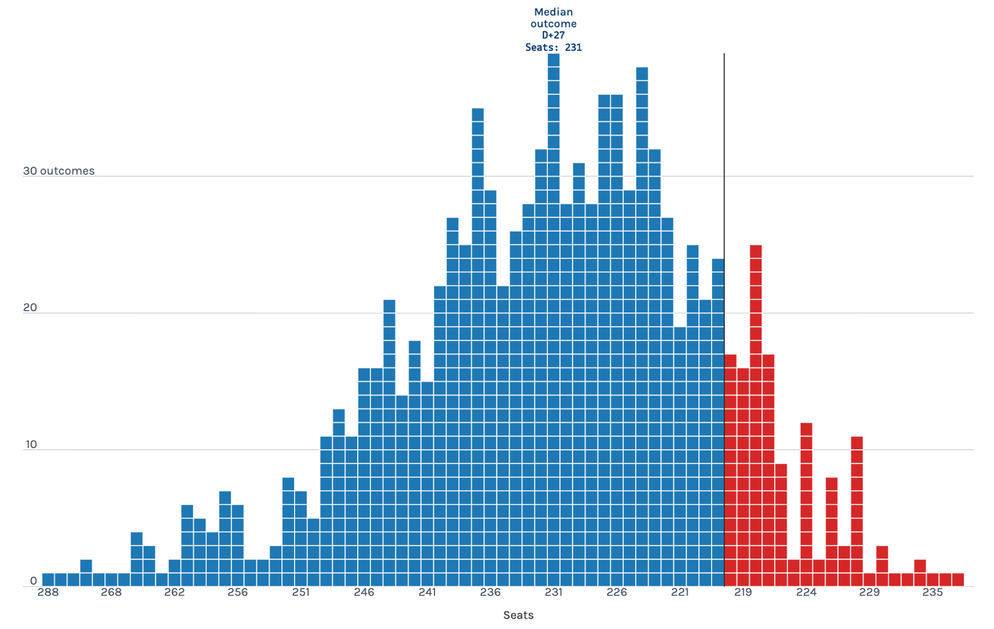
Traditional histograms in statistics are bar charts used to show a distribution of outcomes, where groups of like outcomes are assigned to a bar on the x-axis and the height of each bar reflects the frequency of occurrences in each of these bins. (For us, because we are running individual simulations, it’s important to emphasize the individual outcomes in each case.)) My starting point for visualizing statistical concepts is both with the source and the understanding of how statisticians visualize their data. I look at charts from research papers and try to simplify those down to their most important parts, writing down the questions that come to my mind when I first read one and addressing those questions in my design so that they are already answered for the next audience. From there, I take domain-specific knowledge and try to simplify it to cater to a wide audience — in a way that is approachable but still preserves the integrity of the data.
Because visualizing election simulations is a very niche concept, I saw fit to make a couple of changes when designing our histogram. First, I assign each possible House outcome one value on the x-axis instead of grouping margins into bins like D+5 - D+1 and R+1 - R+5, since the probability of each single seat outcome is of great importance. Then, in order to make it clear that the data here is a group of many individual model simulations, I show each of our simulations as their own squares — rather than totaling them and drawing a single bar for that outcome, as in the normal histogram..
I originally had this idea at FiveThirtyEight when designing the 2024 election forecast. I picked up a Galton board — one of many that were lying around — and flipped it over. When the balls fell into the shape of the bell curve I was working to create, I had this idea for the deconstructed histogram.
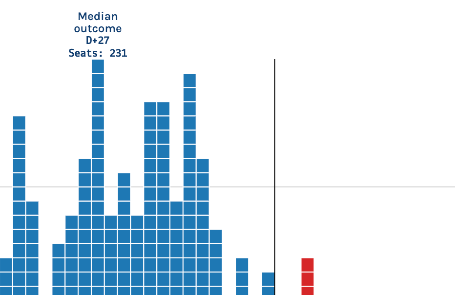
We also spent time deciding what the annotation layer of our histogram should be. The annotation layer introduces readers to the language of the visual. Instead of leaving the audience to parse x and y axes, the annotation explains what one visual element reads and leaves the reader with the verbiage to explore the rest of the chart.
Map
The data: Odds and race ratings of each House and Senate race displayed geographically
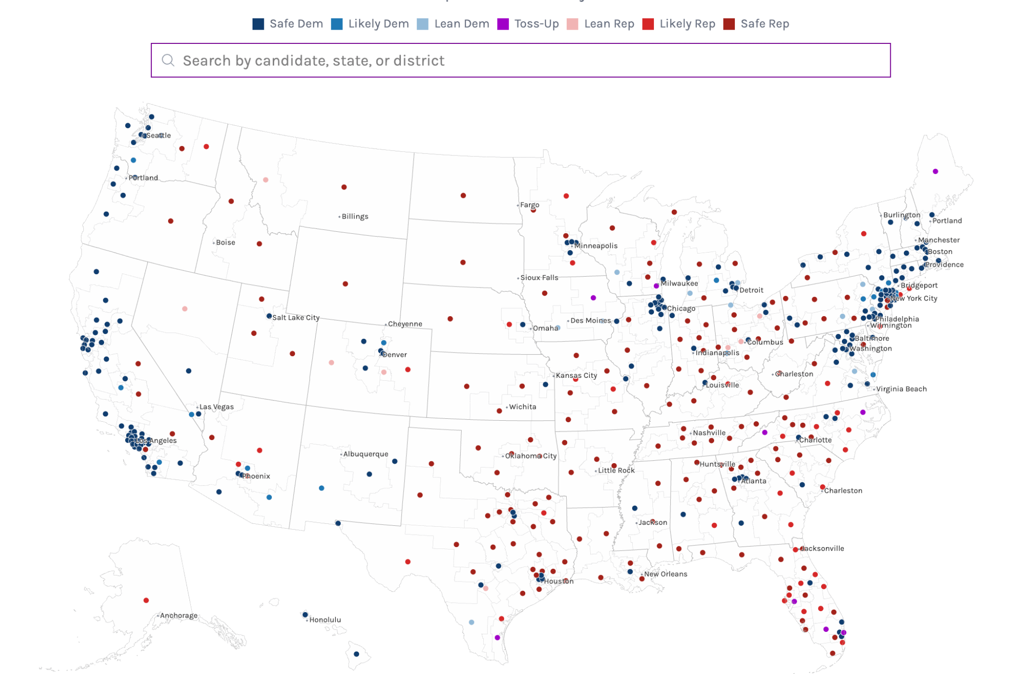
When visualizing geographical data, there are compromises to be made — how much emphasis do we put on geography vs population? The number-one principle is to understand that land mass does not equate to population. This is why chloropleth maps are not the best solution when visualizing voting and representation.
So how do we give equal populations equal weight despite land mass? Some have solved this by arranging squares or hexagons into a suggestion of that state’s geography. That solves the “land doesn’t vote” issue, but a reader loses the geographical context they are used to.
The next question to ask is: “how do we combine both population data with geography?” The first instance I personally saw of a news outlet solving this was the French newspaper, Le Monde over 10 years ago. This is their 2024 version. The squares represent race outcomes but that is still overlaid with the geography with the U.S.
This is why our map overlays circles placed at each district’s centroid with the spatial. Of course this makes it hard to navigate New England states and densely populated areas like New York City and Los Angeles. To solve for this, we have a search for districts and candidate names, plus the interaction flow is set to zoom in on a state before a district can be selected. I want to shoutout the Economist who had the same idea for their geographic prediction model graphic and arranges the circles around densely populated areas nicely.
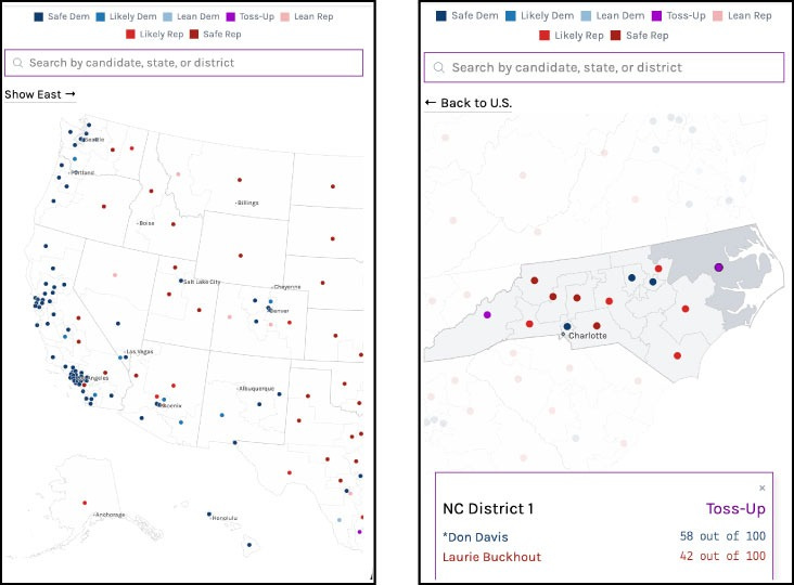
Other design decisions rest on mobile usability. We anchor the tooltips to the bottom of a map instead of having them float by the district on mouse hover or tap. This prevents overlap and hidden touchpoints when a tooltip is visible. It solves for limitations on mobile like screen size and a variety of different interactions like swiping (horizontal and vertical), tapping, and zooming. We also limit interactivity by showing half of the U.S. on smaller screen sizes and preventing any pinch-to-zoom or swiping by offering a button to toggle between East and West.
Table
The data: everything else: odds, race ratings, demographic information, Trump margins
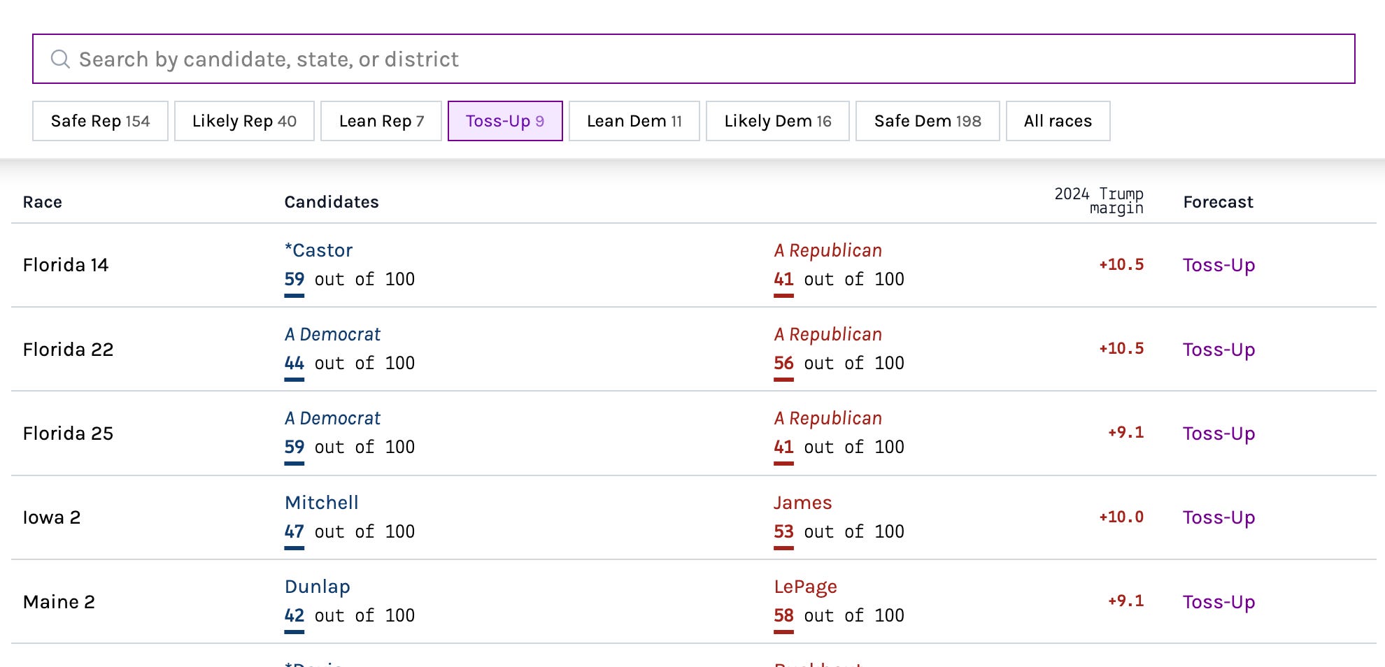
Tables are where we want to present a reader with everything else that is important to understand the forecast. We give users a chamber-wide overview and a district-level view of the forecast. Even through visualizations we’re telling a story, and an inverted pyramid in journalistic storytelling gives readers the top-level information first and more detailed, personalized information the further they navigate down the page.
Tables are for the “power users,” so our table is searchable by state, candidate name, and district. We give readers an initial view of what we think is the most significant information (a list of toss-up races.) But we offer preset filters for race ratings to limit overwhelming a casual reader with too many filtering and searching options.
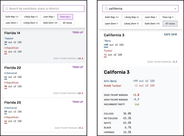
For mobile, we switch to a card-like view like our polls table so that readers can view all of the data without having to scroll left-to-right while also preserving the position to keep it scanable.
With data so rich and complex, the visualization options and decisions are endless. With every visualization compromises have to be made in what to show and how to show it, but at 50+1 we aim for our visuals to reflect the complexity of the statistical rigor that goes into our models and analysis. Stay tuned for more forecast visualizations.
Paid subscribers to 50+1 get access to premium analysis, plus sortable tables and complete data access on our polling website. If you want to follow the 2026 cycle with the best data at your fingertips, become a paid subscriber.
I love the presentation; particularly the map. Conservative friends like to point out the filled-in map, which includes lots of places where tumbleweeds outnumber people. I like to show a satellite map of the US at night, which is lit up where people actually live. This map is much more like that, and hence more representative of the electorate.