

An updated generic ballot polling average for the election cycle
Democrats lead the generic ballot among likely voters by 6 points, but by 5 among registered voters. How do we combine polls of both populations?


Today, FiftyPlusOne.news is updating our average of U.S. House generic ballot polls to better account for differences between likely and registered voters. The topline average margin between the Democratic and Republican parties today is unchanged at D+5.5 (rounding to 6), but you may notice a graphical change on our polls page that we want to explain.
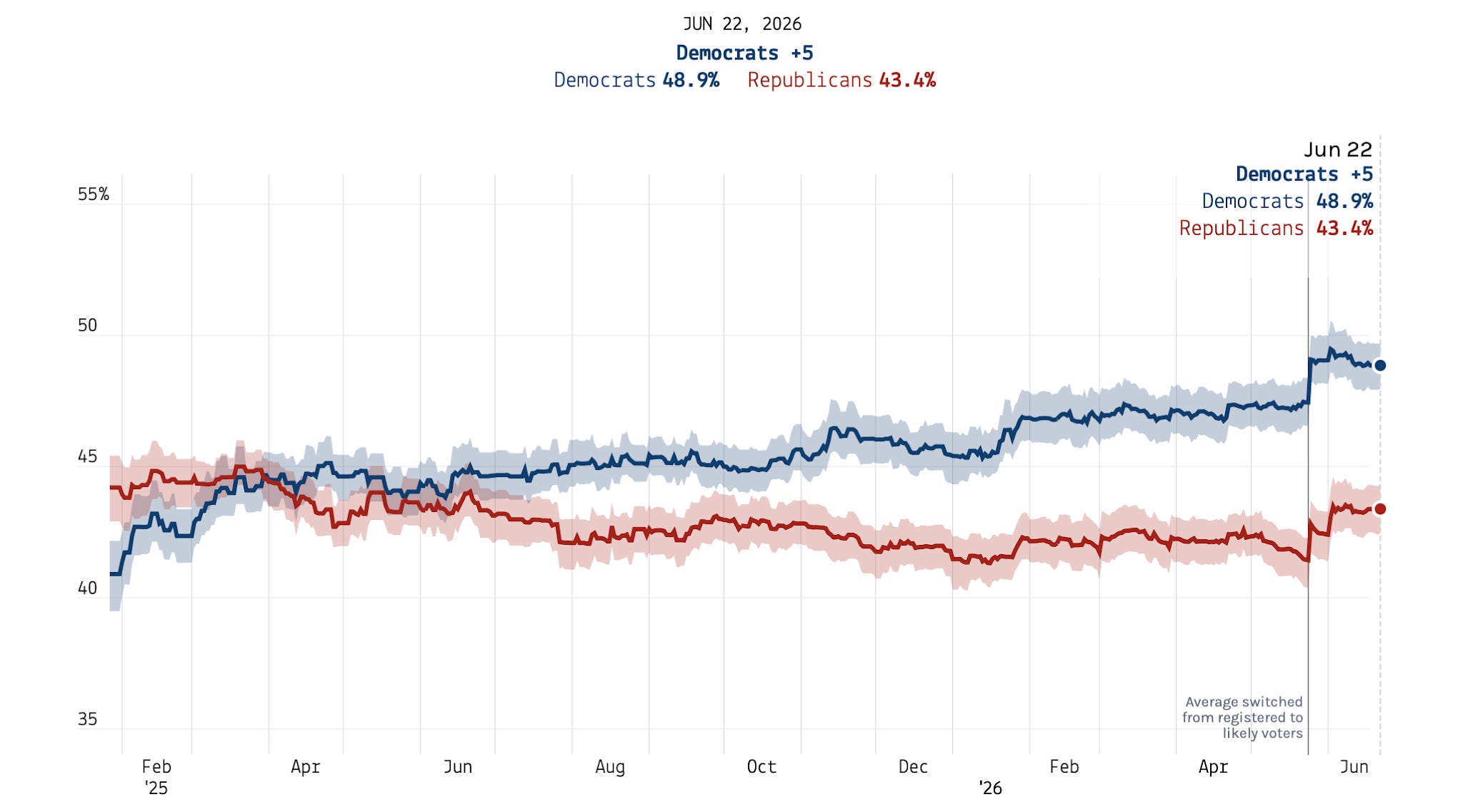
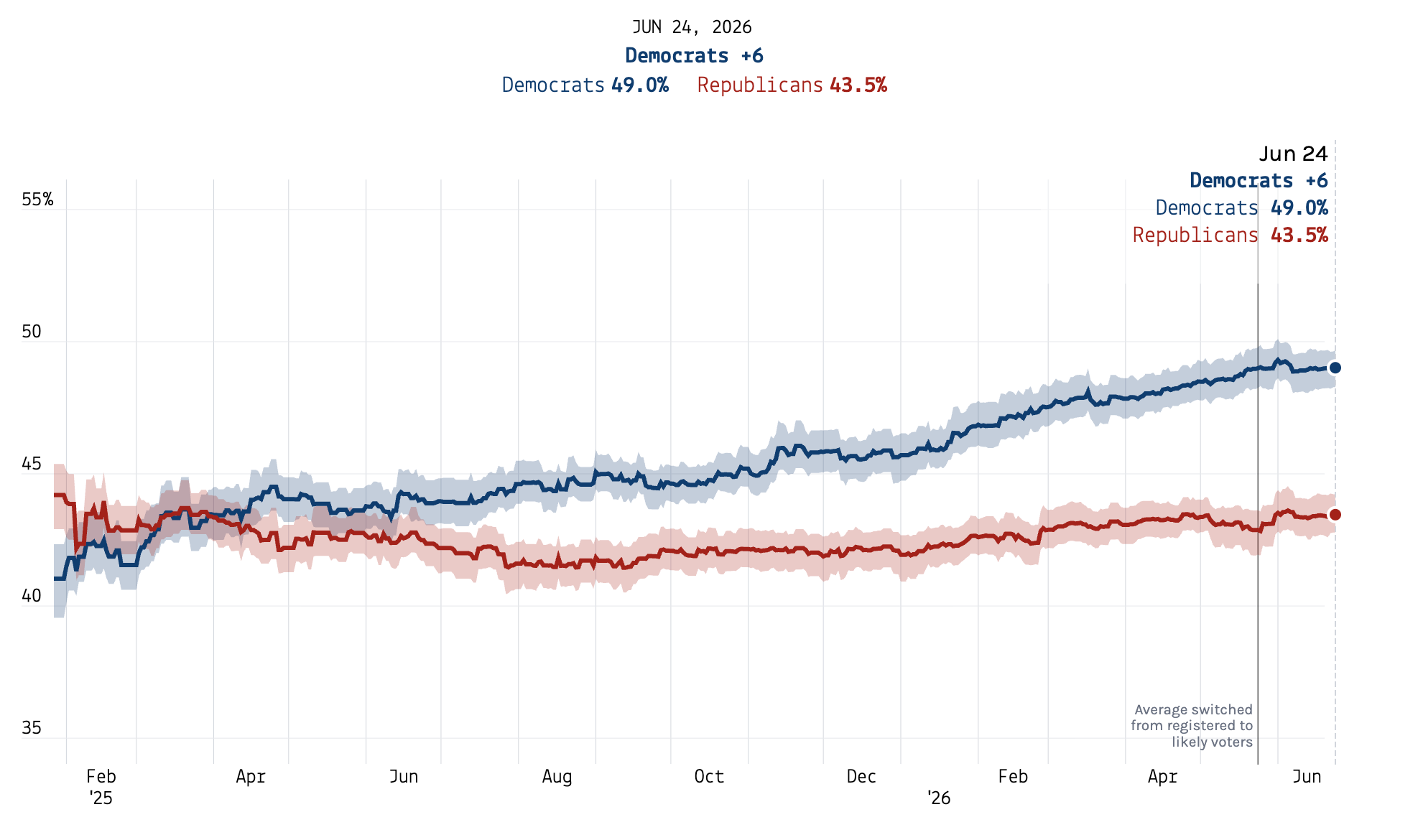
Here is what our published generic ballot average looked like yesterday morning, June 24, 2026:
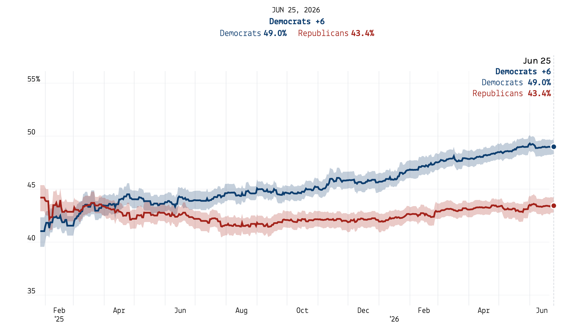
And here is what our generic ballot average looked like this morning, June 25, 2026 (before entering any new polls for the day):
The difference in these trends stems from how the model that powers our averages treats polls of registered voters versus those of likely voters. In this post from the Methods Desk, we explain how these adjustments work and what we changed.
Paid subscribers to 50+1 get access to premium analysis, plus sortable tables and complete data access on our polling website. If you want to follow the 2026 cycle with the best data at your fingertips, become a paid subscriber.
Buy generic
At early stages of the election cycle, most election polls are conducted among registered voters — who pollsters identify either by using lists of registered voters compiled by states or asking respondents themselves if they are registered to vote — but this group is not a perfect match for the electorate in a given year. That’s because there are many registered voters who won’t actually turn out to vote on Election Day. In 2024, for example, there were roughly 210 million registered voters across the country — but only 152 million cast ballots in the presidential election.
To try to produce poll results that better match election outcomes, pollsters also sometimes sample voters they determine (by various means) to have a high likelihood of actually turning out to vote. The number of likely voter polls usually increases the closer we get to the election.
Historically, likely voter polls have offered more accurate predictions of upcoming elections than polls of registered voters (or those of the entire adult population) — so those are the polls we want to anchor most to when averaging pre-election polls for public consumption. However, there are relatively few of these, and other surveys still provide information our averages can use (mostly in detecting trends within groups over time), so we don’t want to throw them out entirely. How can we make use of polls of the wrong populations when calculating an average among likely voters?
The solution we came up with for our generic ballot average is to estimate the difference in support for each party between polls of both likely and registered voters (and all adults). Then we adjust the polls of the incorrect populations back toward the population of likely voters. We do this by subtracting whatever residual our model detects for each of the two wrong populations (sometimes it’s zero!) from all the polls of that population. This makes polls of registered voters “look like” polls of likely voters. Then, the adjusted polls get run through our average, and ta-da! You have an average of public opinion among likely voters.
For most of the 2026 election cycle, we had been running our average of generic ballot polls anchored to the population of registered voters while we waited for pollsters to release more likely voter samples. But we switched the model to estimate likely voter opinion on June 1, 2026 — resulting in those sharp changes in each party’s support that appeared on the old chart.
And that brings us to today. We thought those sharp changes were distracting, so we have recalculated the generic ballot average to smooth out the transition from modeling party support among registered voters to likely voters. Because the number of likely voter polls early in a campaign is very small, this leads to an unstable estimate of the gap between likely and registered voters, and a bumpy average early in the cycle when estimating likely voters.
Our solution is straightforward: We calculate both the average of registered and likely voter-adjusted polls and combine them, putting more weight on the likely voter version as the election gets closer. Now, our generic ballot averages start out at the beginning of a cycle adjusting both likely voter and all adult polls toward those of registered voters. At one year before the election, we add in a likely voter-adjusted version, and begin to slowly increase the weight on this average. In March of the election year, it’s 50-50 between the likely and registered voter-adjusted averages, and by June, the average-of-averages is 100% likely voter-adjusted and 0% registered voter-adjusted.
This approach produces our new, smooth curve in the generic ballot average. We are developing a similar technique for our primary and general-election horse-race polling averages.
And here is our latest generic ballot average as of 10:00 AM Eastern on June 25, 2026:
A fully transparent polling aggregator
One of our organizational values here at FiftyPlusOne.news is to be maximally transparent with our methodology and methods-related decision making so users know what they’re getting and why they’re getting it. We believe posts like this are critical for both building in public in general, and for producing the most trusted, most accurate polling averages (and, soon, election forecasts!) available to the public.
If you saw the updated average online before this article was sent out (I made some code changes late at night before the rest of the team was up to copy check this piece), we regret any confusion this caused you.
Paid subscribers to 50+1 get access to premium analysis, plus sortable tables and complete data access on our polling website. If you want to follow the 2026 cycle with the best data at your fingertips, become a paid subscriber.