



FiftyPlusOne.news is excited to release our flagship congressional election forecast for the 2026 midterm elections to the U.S. House of Representatives and U.S. Senate. Our state-of-the-art model combines polls, historical “fundamentals,” and expert race ratings to forecast winners in each contest and help you understand pre-election polls and other data this election cycle.
You can read more about the state of the midterm race in our launch post here.
This article documents how we built the model(s) behind this forecast. We show what goes into it, how the model processes those inputs, and why you should trust us to provide a well-calibrated read on what public data currently says about the state of all 470 elections (435 House + 35 Senate) across the nation.
We also make these estimates available via API download for people who are interested in consuming our forecast programmatically. Feel free to get in touch with us about acquiring this data. Our business partners help fund FiftyPlusOne’s overall mission of safeguarding the collection and aggregation of all public polling in the U.S. for the foreseeable future.
This model methodology has three parts. First, I explain the inputs of the model. Then, I describe how the model transforms those inputs into one cohesive forecast of each candidate’s vote share on election day. Finally, I describe how our model takes potential error in the polls and other predictors into account.
But before that, I want to explain why we are publishing an election forecast in the first place. Then, I show the proof that it works up front.
FiftyPlusOne is aggregating polls and calculating polling averages and election forecasts for nearly every major statewide and federal election. Subscribe so you don’t miss out:
1. Why forecast?
One might want to forecast an election for many reasons. Maybe you are a campaign or super PAC and want to determine, statistically, which races are the closest so you can allocate resources effectively. Maybe, as was the case for George Gallup and his contemporaries, you are academically interested in how accurate polls are. You may also think that synthesizing polling and fundamentals data could help you learn about how and why people make decisions when voting. Or perhaps you are a degenerate gambler and would like to wager against the prediction markets. Whatever the reason, the popularity of election forecasting is itself revealed demand for the tools.
However, none of these reasons are why we at FiftyPlusOne forecast election outcomes. Yes, of course, we want to accurately anticipate the result of the election — but as mentioned, our fundamental goal with this business is to be good stewards of polling data. We believe in the democratic value of public polls and their centrality to things like understanding voters’ concerns after elections. It follows that properly understanding the error that is inherent in preelection polling in particular — the limit of most of the public’s exposure to polls — is crucial so that people don’t lose confidence in surveys produced for other purposes.
In other words, we aim to produce a well-calibrated prediction of what an election might look like if public polling is “wrong” the way polls have historically erred (typically in one direction across states/contests), such that we minimize collective shock at errors that lead people to disavow polling entirely.
And if you don’t buy into that, I have a simpler explanation for you: If smart people don’t forecast elections, it won’t mean there are no election forecasts; it’ll just mean there are bad election forecasts. Further, we think forecasting is fun.
We have built what I believe to be the most comprehensive and truly Bayesian model of election outcomes available in U.S. media today. Here’s how it works.
2. Model overview and backtest record
The FiftyPlusOne method for forecasting the House and Senate draws on existing journalistic approaches to election forecasting as well as the academic literature on Bayesian models and correlated election polling errors. Our forecast “model” is in fact four models — three models of (1) what the polls say, (2) what the historical fundamentals say, and (3) what professional race handicappers say, plus (4) an “ensemble” model that combines the out-of-sample forecasts from each component model according to how much each has erred against past elections. We can then use the historical error of the ensemble model to simulate the whole election many thousands of times to work out not just who is ahead, but how wrong polls and other predictors might be, and how the race would move if they are.
Formally, our approach is called Bayesian model stacking (we shied away from the most complex version, Bayesian hierarchical stacking, for lack of development time) and is rooted in academic work showing that combining predicted probability from competing models leads to better forecasts on out-of-sample data. While some election forecasters gather time series of predictors, ignore their uncertainty, and, for example, stick them in a weighted average, our model learns the weight it should put on each component forecast based on the total uncertainty each model has about the outcome of the election — including, in the case of the polling model, the role of factors such as partisan nonresponse.
On top of this insight, we add a step that calibrates the ensemble itself to account for how forecasting errors have been shared across similar states and districts over time.
But enough about the Bayesians and their statistical tricks. I detail more about how the model works in section 3 below. What we really care about is how the model performs.
I have designed no fewer than four national election forecasting models from scratch for major media and industry clients over the last decade. (This was not by choice. Each time I have left an employer, I have had to build a new one). My presidential election model for The Economist beat the competition in the 2020 presidential race and, at ABC News/FiveThirtyEight in 2024, my House and Senate model outperformed both (a) all other statistical forecasters and (b) all the prediction markets in a series of third-party tests. The FiveThirtyEight presidential model in 2024 was also better calibrated than prediction markets in anticipating Trump’s chance of winning the popular vote (about 30 percent in our model, and about 25 percent on Polymarket and Kalshi).
I mention this not to brag, but to point out that the statistical foundations of this new approach (Bayesian methods with model ensembling) have a proven track record. But to further gauge expected accuracy, I also ran our forecast on every federal election from 2012 to 2024 in “out-of-sample” mode — that is, only factoring in the data we had at that point in time (so, in July of 2012, none of the elections from 2012 through 2026). More details on how these tests were conducted are found in section 5.
The out-of-sample forecasts according to our model are as such for both the House and Senate from 2012 to 2024:
There are some cycles you could quibble with (and a few more months of model tinkering may increase accuracy), but this record is, in precise mathematical terms, completely okay with us, especially for our purposes. No statistical forecaster, for example, predicted a Democratic House in 2024, and few were as confident in the party’s chances of holding the Senate in 2022 as we were.
Our forecasts are also well-calibrated at the seat level. On average, a candidate we said was favored to win has lost their race in just 83 out of 2,129 out-of-sample forecasts. Our historical accuracy is 96.2 percent on 1,959 House forecasts issued in 2016-2024 (when most other forecasts were active), and 95.3 percent on 170 Senate forecasts.
Excluding toss-up races (where the probability for the leading candidate is less than 65 percent), our model has never made a wrong “call” in the Senate, and has erred in just eight House races.
While we cannot be sure that future performance will exactly match these historical backtests, I am confident we have done our due diligence in accurately checking the calibration of our novel method. Additionally, the accuracy statistics of 96.2 percent (House) and 95.3 percent (Senate) and Brier score of 0.029 (House) and 0.049 (Senate) rival those of the best public forecasts in the world. (In fact, a predecessor of this model I created for FiveThirtyEight in 2024 generated the most accurate House and Senate election forecasts the outlet ever issued.)
If you want more of the nitty-gritty details of our methodology, read on. To view our 2026 election forecasts and polling averages for the House and Senate, click here.
Paid subscribers to 50+1 get access to premium analysis, plus sortable tables and complete data access on our polling website. If you want to follow the 2026 cycle with the best data at your fingertips, become a paid subscriber.
3. What we feed the model
In figuring out who is ahead in an election, forecasters typically consult three sources.
First, there are the polls. Polls are great predictors — generally better than the others that follow — because they tell us what voters in a specific race actually say they will do. Where there are recent, competently conducted polls, nothing beats them. The problem is that not all polls are created equal, and most races do not have any — the vast majority of the 435 House districts will never be polled publicly, not even once.
Then there are the fundamentals, predictors social scientists have long included in their models for their predictive abilities. Voters in a House or Senate seat typically vote similarly to how they did the last time around, for example, so forecasters might use the lagged result in a seat or the Democratic candidate’s margin in the last two presidential elections as a predictor in a model. Candidates who are incumbents also typically perform better, and those who don’t raise much money from individual contributors also do worse. Other predictors matter too, and are detailed in section 3.2.
Another good source of preelection forecasting alpha is expert race ratings from major handicappers — Cook Political Report, Sabato’s Crystal Ball, and Inside Elections — which classify each race from Safe Democratic to Safe Republican. These are human judgments and fallible, but experts often factor in information the other two predictor sets cannot. Handicappers talk to people who run campaigns, the candidates themselves, and are plugged into insider group chats and email chains where non-public polls abound. Even if you have polls and the fundamentals, accounting for expert ratings typically helps performance.
Finally, a word on prediction markets. Other forecasters are increasingly using prediction markets as signals in their forecasting systems. We do not, for reasons I will explain in detail a separate blog post soon. The general position, however, is summed up here: There is a poisonous logical circularity in using prediction markets to update a statistical model when the statistical model is itself being factored into the prediction market. Because of these limitations, our opinion is that if you’re going to inject prediction market data into your forecasting model, you should at least let users view a version that doesn’t rely on such data.
Our model draws on historical polling data going back to 1998, hand-entered race ratings and candidate filings dating to the same year, fundraising figures from FEC filings, and past election results, district boundaries, and demographic data from multiple sources. (Special shoutout to the folks at The Downballot for providing us some early data on presidential vote history and demographics for new congressional districts.)
3.1. The polls
With few exceptions, FiftyPlusOne uses every publicly available poll of the 2026 congressional elections. Each survey is then weighted and adjusted for several factors that might influence its results and the weight it has in our model. We consider:
When was the poll taken? A poll from March is less predictive of how people will vote than one from October. We thus decrease the weight on older data (by about 3 percent per day early in the cycle, and 14 percent in the final two weeks), and apply a trendline adjustment to older polls to account for how the national environment may have moved since it was taken. The details of the trendline adjustment are given in section 3.1.1.
Who conducted the poll? Some pollsters produce results that are consistently between 1 and 4 percentage points friendlier to one party over the other. We account for this with what we call a “pollster effect” or “house effect” adjustment. We measure the tendency for each polling firm to produce numbers above or below the average in each race. But, in an improvement relative to other forecasters, we fit the house effect adjustment not only at the individual race level but across races in a given cycle. This gives the model more information about how a pollster may be thumbing the scale, and is the primary reason our model was correctly bullish on Democrats to take the Senate in 2022.
How did the pollster interview people? We also apply a “mode effect” adjustment, accounting for the tendency of polls produced via different methodologies (live phone, text-to-web, online, etc.) to produce results that are biased in the same direction. This adjustment is fit identically to the house effect adjustment, but groups surveys by sampling and interview methodology instead of by polling firm. It is generally much smaller than the house effect adjustment, with an average mode effect of less than 1 point across cycles.
Who was surveyed? Polls of all adults, registered voters, and likely voters consistently give different answers. We estimate the systematic gaps between them and adjust polls of adults and registered voters toward the population of likely voters. Typically this adjustment favors Republicans, but in 2026 Democrats have been doing 1-2 points better in polls of likely vs. registered voters.
Who paid for the poll? Looking at all House and Senate polls released since 1998, our model finds polls sponsored by campaigns and partisan groups overestimate support for their side by about 2 points. We shift these polls back toward the other party accordingly and give them less weight in the model (by about half).
That’s pretty much it in terms of processing polling data, with a few big flags. First, we do not use results of “synthetic” or AI-generated polls — primarily for the same reasons we do not use polls generated by statistical models (such as MRP) that distill national surveys into statewide or district-level estimates; neither are generated by processes that produce independent and normally distributed results, which our models need to capture uncertainty in polling data. And in the case of AI-generated data, we consider these to be predictions not rooted in sampling public opinion, for which we have no track record to gauge accuracy. In the past, we have likened using someone else’s predictions in our model as “using someone else’s barbecue sauce as an ingredient in your own.”
Additionally, we do not use polls that test hypothetical races, such as of a general election that includes a third candidate who has not entered a race yet. If a pollster surveys a race and presents results testing both a two-way matchup between major candidates and a multi-way matchup that includes minor-party candidates that are also running (such as a Libertarian candidate), our model uses the multi-way ballot and disregards the restrictive two-way.
Finally, we do not include polls from firms that fail to meet our methodological and ethical standards. This omits a small number of non-influential data points from our models.
3.1.1. From polls to a polling average
Because polls are subject to various sources of noise, we combine them for each race using an aggregation model. The average in a given race is built using a three-pass exponentially weighted moving average (EWMA), the steps of which are as follows:
Windowing, weighting, and adjusting. For any given day, we include all polls of a race that were fielded in the past 90 days. Each is weighted according to its recency (with steeper down-weighting for older polls as we get closer to Election Day) and adjusted for its population. We then apply the trendline adjustment to these corrected poll observations by adjusting each poll for movement in the generic ballot since it was conducted. If, for example, a poll is three weeks old and Democrats have gained 2 points of vote share in the generic ballot in those three weeks, we add 2 points to the Democratic candidate’s vote share in the poll (and subtract 2 from the Republican).
Pass 1: trendline-adjusted average. We can then calculate the support for a given candidate on day d by calculating a weighted average of all the surveys from day d-90 to d. Steps 0 and 1 are then repeated on every day of a campaign, which gives us our “first pass” of the EWMA for a given race in a given cycle.
Pass 2: house effects. We then adjust each poll for its pollster’s house effect. Each firm’s house effect is calculated in three steps. First, we measure the pollster’s cycle-wide lean: its average deviation from the first-pass averages across every race it polled this cycle. Because a lean measured from just a handful of polls could easily be noise, we shrink it toward zero in proportion to poll volume, keeping n/(n+5) of the measured lean for a firm with n polls — so a pollster needs about five polls before we take its lean at half strength, while a firm with 50 polls keeps over 90 percent of its measured lean.
Second, we allow the house effect to vary by race. We measure how much the pollster’s lean in a specific race differs from its cycle-wide lean, and add back n/(n+20) of that difference, where n is now the firm’s poll count in that race alone. The much larger constant makes this term deliberately skeptical: A race-specific quirk measured from two polls keeps less than a tenth of its value, because house effects are mostly a property of the firm, not the firm-race pair; a pollster that runs 3 points friendly to one party tends to do so everywhere.
Finally, the cycle-wide lean is itself softly anchored to a prior built from the firm’s lean in past cycles, with each older cycle counting half as much as the one after it. This historical prior is deliberately weak — capped at about a fifth of the blend in the House and a tenth in the Senate — so a firm’s past behavior informs the estimate, but does not outweigh the evidence of the current cycle.Pass 3: population adjustment. Last, we align every poll to a likely-voter population frame. We estimate the gap between likely-voter polls and registered-voter and all-adult polls in the current cycle, shrink those gaps toward their historical values for each chamber, and shift non-likely voter polls accordingly. (This is the same adjustment described in section 3.1; polls of likely voters pass through untouched.)
One wrinkle: We do not show averages for a race on our website unless that race has three polls from two separate pollsters, but the version we feed into the forecast model has no such gate. This has two effects: First, you may see slight differences in our polls-based forecast for a race and the average for it. These are separate models serving separate purposes. And second, it increases the sparsity of the polling signal for the eventual model. The “polling average” from contests with fewer polls thus deserves less weight in our forecast. The next section explains how we account for that.
3.1.2. Inferring the polling average in unpolled seats (the “now-cast”)
A polling average only knows about seats that have actually been polled. But what if a race has no polls at all? For the many races nobody surveys, we use our now-cast polling model, which we published in early July, to estimate what a poll would say based on surveys in similar seats. The linked post contains a full technical description of the now-cast model, which I recap here.
The now-cast’s job is to predict what the polls would say in a seat if it were polled today. The best predictors of that outcome are (a) the generic ballot today and (b) the way the seat would have voted, relative to the nation as a whole, in the past presidential election. We calculate this for every seat, polled and unpolled, and use it as the starting point for the now-cast.
Then, we use a regression model to predict the results of actual district-level polls given that starting point. This model also considers whether an incumbent is running in a seat, and how that incumbent has performed in previous elections. We can then use the coefficients from that model — which capture how much better or worse Democrats and Republicans are doing nationwide, plus the residual for incumbents from each party, relative to baseline expectations — to predict the polling average in the remaining, unpolled seats.
For a seat with polls, the now-cast reanchors the predicted polling average to the seat’s real polling average. This anchoring is loose when there is only one poll in a seat and very tight as the polls pile up. Concretely, the anchor allows about 2 points of slack at one poll, tightening rapidly to a floor of roughly a third of a point — an allowance for residual house effects and party overperformance — by about five polls.
The now-cast makes its projections for all House and Senate seats simultaneously. It simulates the election thousands of times based on how off the now-cast has been in past elections, and how much uncertainty there is today about the polling average in each seat.
3.1.3. From now-cast to forecast
Finally, the now-cast looks ahead to Election Day. This produces a polls-only forecast that can be used to calculate win probabilities for each candidate in each seat.
The forecast adds three variables to the now-cast in each seat:
First, we add the expected national change in support for the party out of power over the remainder of the election. In a midterm, the president’s party has almost always lost ground between the summer and Election Day, so we nudge every seat toward the out-party — Democrats in 2026 — by the amount of swing we have historically seen from this point on the calendar. That change is measured across the 1998–2022 midterms, and in our model today is 3 points over the whole cycle, and 1.7 points from July 30. That means if our generic ballot average was D+5, the polls-only nowcast would expect the party to win by 6.7 points come November. This prediction has a margin of error of about 4 points.
Second, we add individual race-level movement to account for the chance something happens in a given contest that is not shared with other seats. The further out we are, the more room there is for things like primary outcomes and candidates dropping out to change the result of the election. The range of potential seat-level variation our model simulates as of late July is about 5 points.
Finally, seats with no polls carry an additional layer of error: Their margins are drawn from the now-cast’s imputation of what polls there would say if we had them. This imputation comes with a large amount of historical uncertainty — a range of about 9 points of margin in the House and 8 in the Senate, with heavy tails allowing for the occasional much-larger miss.
With those three additions, the polling model is complete: For every seat, polled or unpolled, our first component forecasting model produces a projected two-party vote on Election Day, and an uncertainty interval around it.
But polls are not the only source of information we have about a race. That’s where the fundamentals come in.
3.2. The fundamentals
The fundamentals model is a structural model of each seat’s two-party margin, trained only on the history of past congressional elections and no polls. The job of the fundamentals is to tell us what to expect in a race from the things we know before anyone is surveyed at all — things like how the seat votes historically, who is running, and whether they have raised a lot of money or have a strong electoral track record.
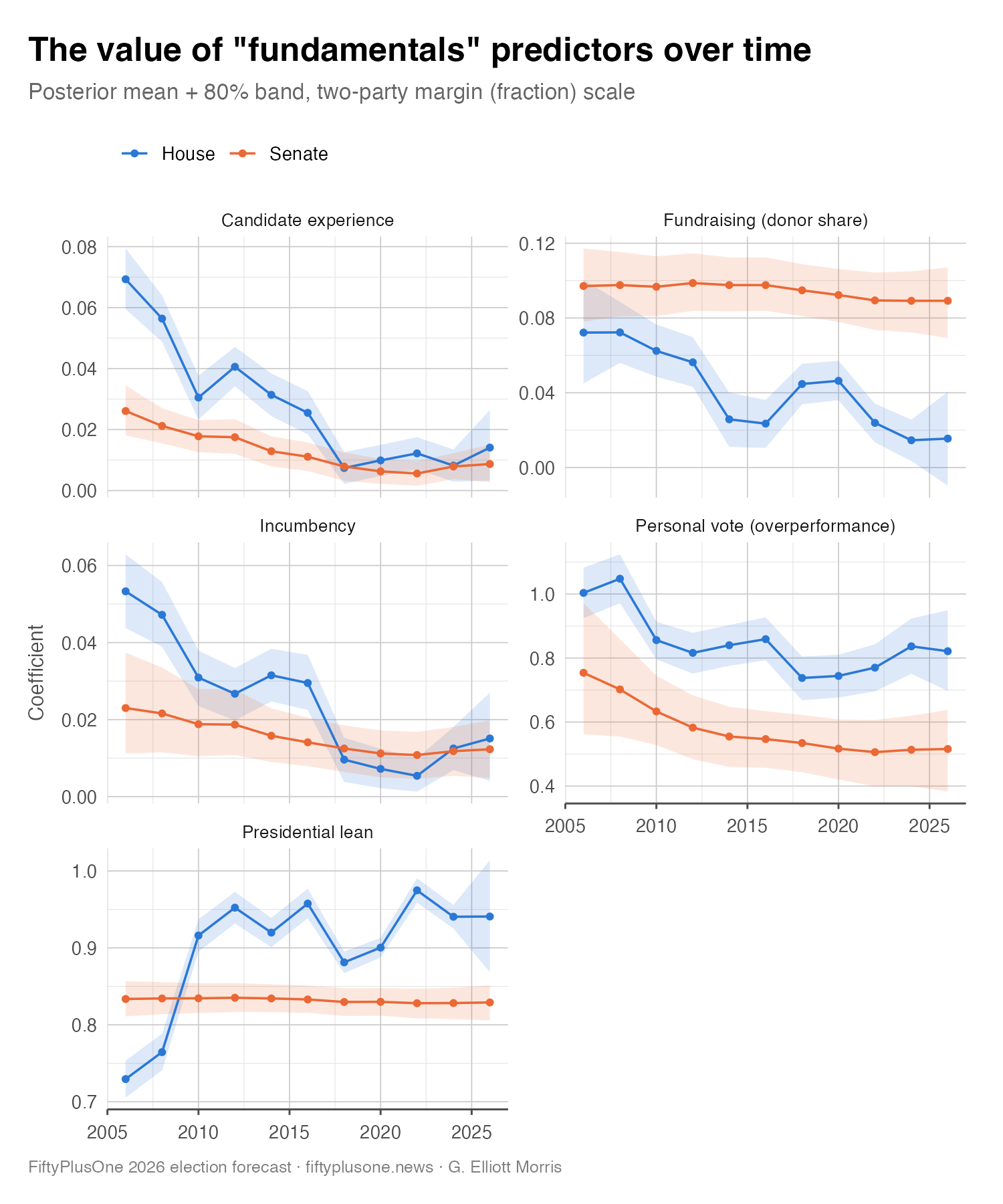
Our fundamentals model is a Bayesian regularized logistic regression model that takes in all regularly scheduled congressional elections from the past 20 years and tells us how much each of these fundamentals correlate with candidate performance. Here is everything the fundamentals model looks at. There are five predictors, in roughly the order they matter.
Seat partisan lean. We calculate the baseline partisanship of a seat by taking the Democratic candidate’s share of the vote in the last two presidential elections in a state or district, subtracting that candidate’s share of the national popular vote, and then blending the two observations, giving 80 percent of the weight to the more recent and 20 percent to the more distant. Then, we add that number back to 50 percent. This value tells us (in terms of two-party vote share) what we would expect to happen in a seat in a completely tied national election. In an era of nationalized, straight-ticket voting, this single variable does most of the work, mapping nearly one-to-one onto congressional margins.
Incumbency. We also include a variable measuring whether an incumbent is running and if so, for which party. Our model finds incumbents win a few points more of the vote share than their district’s lean alone would predict — though, as we will see, less than they used to. We program in the default assumption that first-term members, who have not yet built a full personal brand, get half the credit as other incumbents.
Candidate experience. We also measure whether a candidate has held prior elected office. State legislators, mayors, and former officeholders run measurably ahead of first-time politicians — usually by about a couple of points — and, like incumbency, this can only help the side that has it. We measure experience differently for the two chambers: In the House, where the distinction that matters most is simply whether a candidate has won anything before, experience is scored as a binary: one point for winning any prior elected office, zero for a first-time candidate. In the Senate, where the field ranges from state representatives to sitting governors, we use a graded zero-to-three scale: A candidate gets one point for winning state-legislative and local offices, two for being a member of the U.S. House or other major statewide official, and three if they are a current or former U.S. senator or governor. Experience points are only given to candidates that have won their office in an election; being appointed to serve as a senator is not the same as having faced voters. In 2026, a point of experience is worth about 1.3 points of two-party margin in the House and about 0.9 points in the Senate, so a maximally experienced Senate candidate facing a first-timer starts with a roughly 2.5point head start.
Fundraising. The fundamentals model also takes into account how much each candidate has raised from individual donors, which we parse from bulk FEC filings. Specifically, the model factors in the Democratic candidate’s share of the two parties’ combined receipts from individual contributors. We omit fundraising data from races where we have missing data, such as when a candidate hasn’t filed their paperwork on time. Fundraising is a stronger predictor of candidate performance in the Senate vs. the House.
Previous performance. Finally, for incumbents we include a variable we call the “personal vote,” which measures how much they have historically over- or under-performed their district’s partisan lean as calculated in the first step above. We build this variable by studying a candidate’s whole career and weighing recent performances more strongly. In the past, we have directly modeled these variables for editorial purposes, but decided to use a more parsimonious approach this year while we test out this new projection model.
Importantly, whereas other forecasters’ models often assume the value of things like incumbency and fundraising is fixed in the training period, ours allows coefficients to drift over time. As Lauderdale and Linzer (2013) argued in their study of fundamentals-based forecasting, the normal approach to fundamentals modeling produces predictions that are both less stable and less certain than their tidy regression coefficients make them look; a predictor that mattered a great deal in one year can fade in the next, and a model that pretends otherwise will be overconfident out of sample.
So rather than fit one fixed coefficient per variable, we let each one drift from election to election, and we carry its uncertainty forward into the forecast rather than hiding it. Each coefficient in the model is allowed to move as a random walk over time (specifically, we use a dynamic linear model with a logistic link function). The image below plots the influence each predictor has on a candidate’s share of the two-party vote:
For every seat, the fundamentals model produces an expected two-party vote share for the Democratic candidate and — just as importantly — an honest measure of how unsure it is. That uncertainty is not the hairline standard error of a regression coefficient; it’s the full predictive spread, which is wider, and which grows in exactly the competitive seats where the structural story is most contestable. Both the estimate and its uncertainty then go into the blend (Section 4), where the fundamentals are just one of three voices.
So far, all of the factors going into our model have been quantitative. Quant is great, but let’s talk about the qual:
3.3. Race ratings
While they are not “objective” indicators the way polls and fundamentals are, we have found a lot of value in incorporating expert race ratings into our prediction models. The three major national handicappers — the Cook Political Report, Sabato’s Crystal Ball, and Inside Elections — each place every federal election on a scale from Safe Democratic to Safe Republican. These ratings undoubtedly consult a lot of the same data we do (they may even shift according to forecasting models), but they also factor in data we don’t have, such as private campaign internals that handicappers get shown and we never do.
We produce a forecast from expert race ratings in a three-step process. First, we turn the labels into a predicted margin of victory for the candidate. This step is necessary to translate the language of the rater (e.g., “safe” or “likely”) into the language of our model (vote share). Using a historical dataset of race ratings going back to 1998, we score each rater’s call on a scale running from +3 (safe Democratic) through 0 (tossup) to −3 (safe Republican). We then take these numeric ratings and train a regression model to predict the realized election margin given the consensus rating across every seat a rater has ever graded. We estimate this model separately for each chamber. We then apply this model to current race ratings to translate them into vote shares.
Second, we correct for handicappers’ tendency to lag the national environment. By studying historical ratings we have found that handicappers tend to move too cautiously. In particular, in midterms, they are reliably slow to shift competitive races toward the party out of power. The chart below shows this dynamic. Pooling ratings from different time horizons over the last five midterms, a seat still rated a tossup 180 days out from the election finished, on average, about 3 points in the out-party’s favor. A seat Cook rated lean-against the out-party that early came in a dead heat (+0.3 for the out-party). So in tossup- and lean-rated seats, we nudge the margin implied by race ratings toward where the national environment currently is — as measured by the generic ballot — by an amount that would have historically shifted the ratings closer to election outcomes. This amount is largest early, when the handicappers have the most catching up to do, and fades to nothing by Election Day, as the ratings converge on the result.
Third, as with the other models, we measure how reliable this method is at predicting elections historically, and then account for uncertainty. We do this by running the ratings-only forecast on past elections, only training the ratings-to-margins model and environment-adjustment models on the data from previous cycles and applying them to the year in question. We then measure how accurate the model would have been in out-of-sample years, and use those values to simulate what could happen if the raters are wrong, in every race, while adjusting for predictable changes in the national environment.
This process gives us a quantitative distillation of a qualitative outside check on our other models. In some cases, race raters catch things the other models miss, and we want to use that information in our forecast too.
But how do these three forecasts get combined into one single estimate?
4. How we combine the three models
This is where things get pretty cool. Because we have trained three independent forecasting models, with point estimates and uncertainty intervals for every seat, we can combine these predictions based on the uncertainty we have about them. (Math-heavy paper here.)
We calculate an “ensemble” forecast for each seat by assigning a weight to each model’s prediction based on how accurate it is on out-of-sample data. The more precisely a source model has pinned down past races, the more it counts. Since polls are historically the best predictors of election results, the polls model has tighter uncertainty intervals than the other models, and tends to get higher weight.
By weighting by uncertainty, instead of some ad-hoc value assigned to each model uniformly, the model also puts more weight on predictions that are more confident. For example, the weight on the polls model is larger in races with a dozen recent polls (because the uncertainty on the polls forecast is lower), while a race with no polls leans more on fundamentals and ratings. And the balance of the weights also shifts naturally across the calendar: In the spring, when polls are sparse and uncertainty from potential change between spring and Election Day is high, polls naturally take a back seat. But as November approaches and the potential for polls to shift decreases, the polls model takes on more weight.
We do make several adjustments to the base weights derived from uncertainty intervals. First, we have found that non-polling indicators are less accurate in Senate races where no incumbent is on the ballot. Open Senate seats with no incumbent get less weight on both fundamentals and ratings. Additionally, when the polls in a heavily polled race disagree sharply with the structural estimates, we slightly increase the weight on the polls; this helped our model correctly anticipate Senate victories for Democrats in red states in 2012. Finally, we are careful not to over-shrink competitive House races toward safe ratings, because doing so has historically made predictions for surprise upsets that the polls saw coming worse. (We think this problem is related to the one that causes race raters to lag national data.)
By Election Day in a typical cycle, the House forecast is roughly half polls, 40 percent fundamentals, and about 10 percent ratings. The Senate leans harder on polls later, since Senate races are polled far more heavily. Four months out, those numbers roughly invert and the fundamentals lead in both chambers.
It is worth underscoring something, however: The weights above are expected values based on the number of polls and accuracy of the fundamentals and ratings in past cycles. Because the ensemble’s weights are based on the uncertainty of the input models, they are subject to deviate from the historical trends. If we have more polling this cycle than in the past, the model will be more polls-based.
At this point in the ensemble, we have point predictions in every seat. But the weighting of the component models has removed their uncertainty, so we need a method to add that back. And how do the predictions in each seat get added up to national forecasts?
4.1. How we account for uncertainty in the ensemble model
Warning, it’s about to get nerdy.
By far the thing we spent the most time on — and perhaps the most important factor, since it affects the headline probabilities readers consume and share — was correctly estimating the uncertainty in our predictions. Our forecast model has to correctly estimate uncertainty from two major sources: time and polling.
Temporal forecast error is rather trivial to assess. We simply take the historical point-in-time ensemble forecasts for each seat, and calculate the average absolute error by chamber. The errors of our ensemble and each component model are shown by forecast time horizon in the chart below.
The second source of error is trickier to get right. When polls miss in one state or district, they tend to miss in others. In 2016 and 2020, they understated support for Republicans nearly everywhere. In 2012 and 2022, they underestimated Democrats. So if our forecast is 3 points too Democratic in one Pennsylvania district, it is probably 3 points too Democratic in Ohio and Michigan too. A model that treats each race as an independent coin flip will badly understate how lopsided election night can be — it will tell you a 40-seat swing is essentially impossible, when the country produces one every decade or so.
4.1.1 Five levels of error
But the precise way to take into account these correlated errors is largely up to the modeler. By extensively evaluating our historical forecasts over the last 20 years, we have determined the following error structure is the best way to account for uncertainty in our model(s). In each simulation, our model adds values for the following errors to the predictions in each seat:
a national error — how far off the whole forecast is this year;
a chamber error, because the House and Senate can miss differently;
regional errors, because polls can be fine in the Southwest and badly off in the Midwest;
state-level errors, for the House model;
a cluster error for groups of demographically similar House districts — built from each district’s age, income, education, urbanization, and racial composition — which lets the model miss in, say, heavily Hispanic seats without missing everywhere; and
an individual race error, larger where there are few polls and where our three sources disagree with each other.
We calculate the amount of error in each group by measuring exactly how wrong the model has been in past elections, at each specific point on the calendar. The uncertainty we publish in July is the uncertainty this model has typically had in past Julys.
So how do we actually measure those five errors, and how do they make it into the simulation? This is the job of a final Bayesian model — which we call an error “meta-model” — whose training data is not polls or election results, but our own forecasting system’s past mistakes.
To build a training set, we run the full ensemble retroactively on every cycle since 2006 in strict out-of-sample mode and record its error for every seat, in both chambers, at every weekly snapshot from about 155 days out through election eve. That yields on the order of 100,000 seat-week forecast errors. With each error, we also record everything the meta-model needs to know about the prediction to train the error model: the cycle, the chamber, the seat’s census region and demographic cluster, how many days remained until the election, how many polls the seat had, how sharply our three component models disagreed with one another, and, crucially, how uncertain the ensemble itself claimed to be about that seat at the time.
The error meta-model then decomposes each error into the sum of the shared shocks listed above: one national shock per cycle (shared by both chambers), a chamber shock, a regional shock, a cluster shock for demographically similar House seats, and an individual seat error.
What the model is actually estimating is the standard deviation, or sigma, of a distribution that produces the amount of error we historically observe at each level. Each sigma — one for each level of error from the above list — follows a simple two-parameter curve over the calendar: a level on election eve, and a growth rate that scales as a square root of the days left until Election Day. From this we know (a) how much error belongs in each component of the forecast model, and (b) how much the error from each level increases as we get further from the election.
One short aside on the individual seat error: Unlike the other terms, which are additive draws from distributions of error, the seat-level error term is a direct function of the seat-level errors of the individual component models from step 3. It’s trained as a multiplier on the ensemble’s weighted-average uncertainty for a seat, with two fitted model parameters that inflate uncertainty (a) where polls are scarce and (b) where polls, fundamentals, and ratings point in different directions.
The error model is fit with a fat-tailed Student-t likelihood whose degrees of freedom equal the number of training cycles — a way of being honest that, however many individual seat errors we observe, we have only watched about ten elections actually happen.
4.1.2 Simulating the election
Once we know how much error belongs to each geographic level, we can use a technique called Monte Carlo simulation to figure out what might happen in the future if the data is as wrong as it has been in the past.
First, what is a Monte Carlo simulation? The name — a reference to the famous casino in Monaco — describes a surprisingly simple idea: When a forecasting problem is too complicated to solve with pen-and-paper math, you can instead play it out many times by varying the parameters of the underlying model and then analyzing the simulated results. This technique works because of the law of large numbers.
Suppose, for example, you wanted to know the probability of being dealt a full house in poker. You could derive that probability from combinatorics, or you could shuffle a deck, deal yourself five cards, write down what you got, and repeat the process a hundred thousand times; the share of hands that came up full houses would land very close to the true answer.
An election forecast poses the same problem at a much larger scale. We have 470 races, each with its own uncertainty, all tangled together by shared sources of polling and other error. There is no tidy formula to derive, given that uncertainty, the probability that Democrats win the House or Senate. So we use simulations instead: For each of 40,000 simulations, we take the seat-level predictions from our model and then add onto them the potential error from each source listed.
Each simulation “draws” one national shock, one shock per chamber, one per region, one per state, and one per House cluster according to the probability distribution of each that is spit out by the meta-error model. For example, if simulation No. 23,001 says the polls were 3 points too Democratic nationally, every seat in that simulation shifts together. On top of that, there’s the possibility that one party’s Senate recruits do better than its House recruits, and that the polls in the Midwest miss by a bit more on top of the national error. Add up all those errors in each simulation, apply them to the ensemble forecasts of median vote share in each seat, and you have yourself a spreadsheet of 40,000 different ways the election could go.
From here, the forecast model just needs to do some simple arithmetic to produce the numbers you see on our forecast page. We can count up, for instance, the share of simulations in which each candidate wins their race — that is their win probability. We can tally the number of seats each party holds in every simulated election, and the share of simulations in which that number reaches 218 in the House, or 50/51 in the Senate, is the party’s chance of winning the majority. Every forecast number you see on our forecast page comes from these simulations.
Two flags on this: First, the simulated shocks are drawn in such a manner that they cancel out on average at the state, region, and cluster level, so they can never change our central estimate or who is favored in a seat. And second, while the number of simulations is quite large at 40,000, it is not so large that it eliminates random variance in our predictions across different model runs. Sometimes the error can change by a few decimal places.
5. How we know it works
As mentioned in section 2, we know our method works well because we have tested it on past congressional elections.
The graphic below shows the match between our model’s predicted probability of victory for a candidate and their realized probability of victory, bucketing by probabilities in a certain range (e.g., 15-30 percent to win, 30-50 percent, etc.). This chart shows probabilistic calibration over the entire prediction time series, from 200 days before the election to midnight on Election Day.
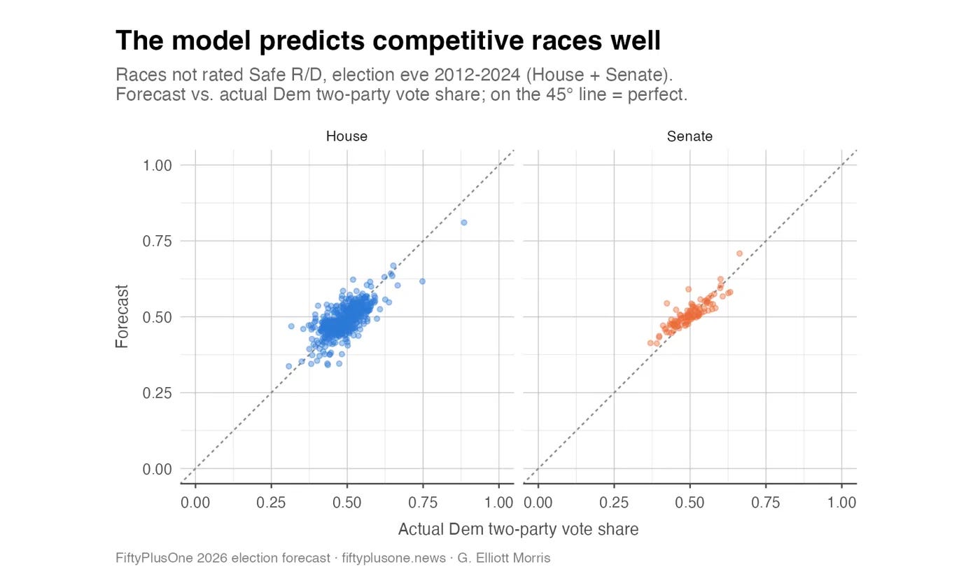
At the current juncture, our probabilities are slightly underconfident at the seat level; candidates who we give a 75 percent chance of winning win their races on average about 82 percent of the time. But we are reassuringly rarely wrong. This chart shows the predicted vote share from our model for House and Senate races not rated as Safe Republican or Safe Democratic:
But how do we actually produce these historical predictions?
Everything we have described so far — the polling model, the fundamentals, the ratings crosswalk, the ensemble weights, and the error meta-model — has dozens of parameters that had to be estimated from historical data. That creates an obvious potential for data “leakage” (we sometimes call it “time-traveling” internally here at FiftyPlusOne): A model tuned on the very elections it is evaluated against will always look brilliant on paper, but will overstate accuracy for races it wasn’t fit to.
To guard against this problem of time-traveling, we borrow a concept from machine learning called a “train-validate-test split.” This process loops through each election to train the underlying regression models only on a subset of data from prior years, validates model parameters using the held-out data from prior years, and tests model performance on the target year. We actually do this method four times: once for each of the underlying component models, and again for the error simulator, using only out-of-sample predictions from prior years in the latter stage.
That’s a lot of information that’s frankly hard to parse even for experts, so here’s a workable example. To evaluate the model’s forecast of, say, the 2018 midterms in July 2018, we rewind the clock and hand the model only the information that existed as of July 2018 — the polls that had actually been published by that date, the race ratings as they stood on that day, the fundraising totals filed by then, and the historical predictors and results of only previous cycles, and only as of July in those previous cycles. The data for elections from 1998 to 2016 then enters a loop of train-validate model training. For each cycle, only the data for the prior cycle enters our set of component regression models, trained in the Bayesian programming language Stan (named after the guy who invented Monte Carlo methods), and then makes predictions for the given cycle.
After this loop is complete, we have out-of-sample predictions as of July for every cycle from 1998 to 2016, to understand the probable predictive power of the data in July of 2018. We then exit back to the outer prediction step for 2018. The forecast then passes the data for July 2018 through the various component models that were trained on 1998 to 2016 data ensembles them using the weights trained on 1998 to 2016 data, and simulates error using the predictive distributions of the error model trained on the out-of-sample predictions from 1998 to 2016.
We repeat this process for every week of every cycle, c, from 2006 to 2024, running the train-validate-test loop for all elections held over the past 20 years (c - 20), which gives us a time series of out-of-sample forecasts as we would have issued them on those days of the campaign. When the 2018 version of the model makes its predictions, it is exactly as ignorant of 2018, 2020, and 2022 as the real 2018 version would have been. There’s no time-traveling to future years.
(In the interest of full transparency: There are two small, deliberate exceptions, where a fixed table of weakly informative priors is shared across test years for computational reasons. Neither contains outcome data, and neither meaningfully moves the results. It just helps our backtest models fit faster, so it takes a day instead of weeks to train and test a given model spec.)
Across every regularly scheduled House and Senate election from 2006 through 2024, this process generates roughly 100,000 individual seat-week forecasts, each paired with the result that actually happened. That archive of predictions is the raw material for the claims we make of accuracy and calibration in section 2 of this article, and it doubles as the training data for the error meta-model described in section 4.1.
One last question a skeptical reader might ask: Couldn’t we have simply tinkered with the model until the backtest looked good? To a degree, any modeler shapes their model with one eye on historical performance (what we call “researcher degrees of freedom”).
This is a fair objection, and only true out-of-sample prediction — on future elections — can prove our model’s forecasting ability is as good as our backtesting suggests. All we can do now is promise that our computer code is coded correctly, and we hope you trust us that we are trying to produce the most accurate read of pre-election polling and other data possible, not simply take a victory lap and promise unparalleled accuracy. Remember, FiftyPlusOne’s overall mission is to provide a well-calibrated translation of polling data to probabilistic forecasts to help the public consume such polls in a smarter way, not to sell you something or make a million dollars betting on elections.
For transparency, we have also published our model’s raw backtests for public scrutiny on our GitHub page.
6. Odds and ends
A couple of small details are worth explaining to the most technical readers in our audience.
Our model makes predictions for the Democratic and Republican candidates’ share of all votes cast for one of the two major parties in a seat. This is an oversimplification of the way elections happen in reality that helps the model fit faster and predict better; it doesn’t really matter for control of a Senate seat that’s 60 percent to 35 percent in favor of Republicans whether the Libertarian is at 4 or 5 percent.
Sometimes, however, there are more than two major candidates in a race — or two major candidates from the same party. Here is how our model deals with those:
Ranked-choice voting (Maine, Alaska). We use the final round of ranked-choice polling, comparing the leading Democrat to the leading Republican — which is how the votes actually resolve, since minor candidates are eliminated and their ballots transfer to the front-runners rather than being summed. For Maine’s Senate race, with one candidate per party, this is exact. Alaska is our one real approximation: We get the party that wins the seat right, but if two Republicans reach the final round, we do not sort out which of them wins.
Top-two primaries (California, Washington). The top two primary finishers advance regardless of party, and eight 2026 races so far are between two candidates of the same party — seven California Democrat-vs.-Democrat contests and one California Republican-vs.-Republican (Washington state has not yet held its primary). Party control of those seats is certain; the question is which candidate wins. We model that separately, from incumbency, fundraising, and field size, trained on past same-party contests in those states.
Louisiana’s jungle primary. This year, every Louisiana House race will put all candidates of all parties on the November ballot, with a December runoff if nobody clears 50 percent. We simulate both rounds, including runoffs between two candidates of the same party.
Primaries that haven’t happened yet. When a party has not picked a nominee, we do not split its vote among the contenders — that would make each look like a loser even in a safe seat. Instead, each simulation picks one potential nominee, weighted by incumbency and fundraising, and then simulates the general election with that candidate. We then pool all of these possible outcomes to forecast the chance that “a Democrat” or “a Republican” wins that seat.
Strong independents. In Montana, independent Seth Bodnar is running alongside Democrat Alani Bankhead against Republican Kurt Alme, and polling far better. Because our pipeline builds every race as Democrat versus Republican, an independent is invisible to it — which meant we were forecasting the wrong contest. We now run that seat as a mixture of two scenarios, one where the Democrat is the effective challenger and one where the independent is. How likely each is, is a judgment call we make and disclose rather than a measurement.
No major party challenger. When a race is between an independent and a major-party candidate, our fundamentals model treats the independent as belonging to the other party. This is the case in Nebraska’s Senate race in 2024 and 2026, for example, where Democrats decided not to run a candidate and the election ended up being between independent Dan Osborn and incumbent Republican Pete Ricketts.
And that’s pretty much it! If you have questions, you can reach out to us at data@fiftyplusone.news.
Frequently Asked Questions
Is this a prediction? No. It is a forecast, a probability distribution over outcomes. If our 70 percent favorites lost every time, the model would be broken; if they won every time, it would also be broken. Empirically, candidates we give a 70 percent chance of winning win about 70 percent of the time.
Why does the forecast disagree with your own polling average? Because the average is only one of three inputs, and early in the cycle it is not even the heaviest one. A race can have one poll showing a tie while the fundamentals and the handicappers both say it is safe. The forecast will say it is probably safe, and history says that is the right call in July.
Democrats keep overperforming in special elections. Why doesn’t the model show it? In our testing, we found that including special elections as a predictor of the national political environment worked until 2018, then fell apart. We think this is because the group of voters turning out in special elections is now systematically different from the group turning out in November.
Does it account for redistricting? Yes. When a seat is redrawn, we recalculate historical election results in the new seats, and we discount the incumbent’s personal vote advantage. Historically, when an incumbent has been drawn into a new seat, they have retained about 70 percent of their incumbency advantage and personal vote. Seats that were redistricted also have slightly more uncertainty than other seats.
The model says 3 percent for something that seems impossible. Is that a bug? Probably not. Our model prices in the chance of systematic changes in the political environment that otherwise seem impossible, such as 9/11 disrupting the 2002 midterm cycle. After 2020, when generic ballot polls were historically off, our model also simulates fat-tailed polling error to account for systematic, unforeseen partisan non-response bias.
Why did the number move when there was no news or new data? Usually this happens when an old survey becomes so old that the polling average in a given race drops it from the training data.
Can I get the underlying data? Yes — see our downloads page or get in touch with us.
Corrections and model changelog
Corrections. While we do not anticipate making any errors, sometimes they happen. We will document any big corrections here.
August 7: The 2020 presidential numbers we used for Florida’s new congressional districts were wrong. All 28 of them were about 4.8 points too Republican. The corrected figures were pushed this morning, and the model has now been re-run with them.
The effect of this error was small, because the 2020 past elections numbers only get 15% of the weight in each district’s partisan lean (the 2024 results, which were already correct, get the other 85%). Florida’s expected Democratic seats went from 6.9 to 7.2, and the chance of a Democratic House majority nudged from 89% to 90%. All seat-level probabilistic differences were under 3 percentage points except in FL-22, which moved from tilt Republican to a genuine toss-up (45% → 51% chance for the Democrat). Nothing outside Florida moved at all, and the national projected win probability and seat total for either party was unaffected. We regret the error.

August 3: An error in our 2024 historical presidential election results data in California’s new congressional districts was detected and corrected on August 2. While the error was caught before publication, the model was not rerun to reflect this change publicly. This impacted most redrawn seats by less than a point, but moved the Democratic candidate’s chance of winning CA-22 up from 72% to 88%. We apologize for the oversight.


Model changelog. While we do not anticipate having to fix anything with the model, sometimes it’s necessary to make small tweaks to our data input or processing pipelines as we watch how the model responds to new data. In rare cases, we notice a problem with the underlying statistical models and have to fix them. We will document any changes to our model here.
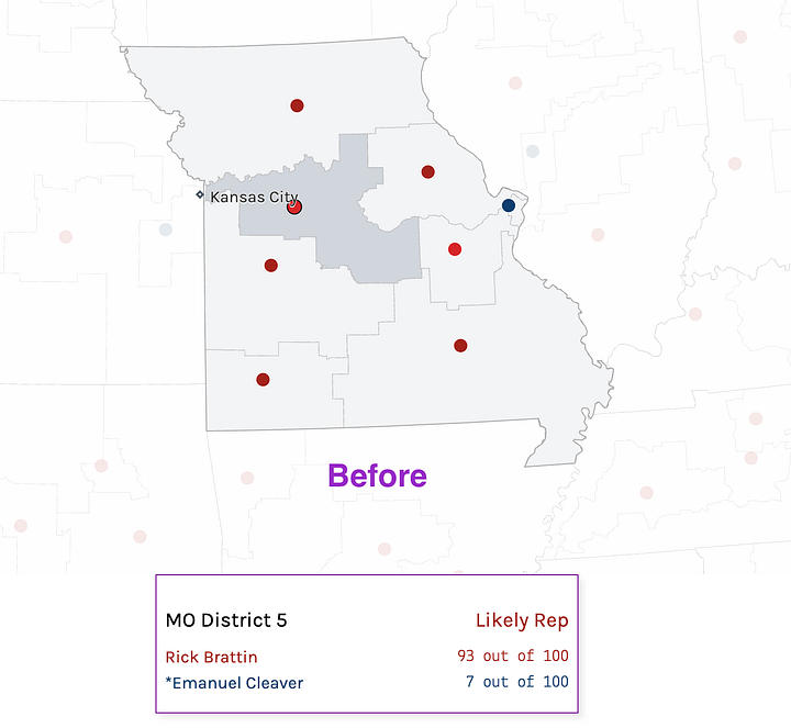
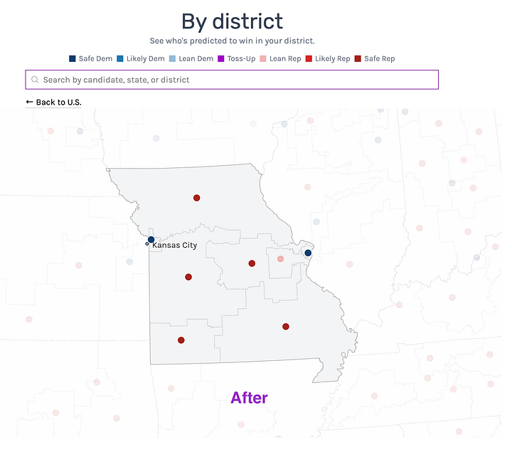
September 11, 2026 - Missouri has a new congressional map. Well, an old map that they’re using again. After a sustained back-and-forth between the Secretary of State, the state supreme court, and U.S. Supreme Court, the state is back to using its pre-2025-gerrymander electoral boundaries (last used in 2024). The model has been updated to use these new old boundaries.
August 3, 2026 - Forecast published
July 20, 2026 - Model code frozen, watching production time series for two weeks to verify forecast moves as expected with new data.


It looks like the Senate distribution has 3,000 little rectangles, not 1,000?
These would be good on the display:
- For each percentage chance for each side for 51+ senators, 52+, etc.
- A graph of the trends over time of chances of majority (currently 89% D House, 55% D Senate), and also the median number over time
Haven't read the post word for word yet so I apologize if I missed it, but will you be publishing a median or modal margin for each race? Might be too big of a load but it would be cool to see the bell curve for each race for the forecasted margins for every run.